Hey, have you ever spent way too long choosing a font for your Instagram carousel and then wondered why it still looks meh? I’ve been there. I’m a writer and content-creator with a decade of real-world SEO and design experience, and I’ve learned fast that font choice fixes half the design battle. Good typography can make your carousel readable, scroll-stopping, and brand-consistent. Bad typography? Well, let’s just say your swipe-through rate drops. Fonts carry tone, emotion, and vibe, so you’ll want the right ones for your brand story. I’ve pulled together the latest picks (free + premium), live in 2025, to help you find the fonts that increase post visibility, nail your brand voice, and keep viewers swiping. Ready to pick the ones you can’t live without? Let’s go.
Why Fonts Matter in Instagram Carousel Posts
Why does typography matter so much when you post a carousel on Instagram? Think of it this way: your words alive on screen rely on style just as much as message. A solid sans-serif typeface or a smart serif can boost readability and mood. One recent study found typography choices influence how users interact with Instagram adverts, things like font type, size, and spacing impacted attention and credibility.
When you pick the right display fonts, bold italic font styles, font weight variation,s and vertical letter spacing, you create a visual rhythm that keeps viewers swiping instead of scrolling past. And since carousels tend to get higher engagement than single posts (FYI,) one study reported 1.92% engagement for carousels vs 1.74% for single images.
In short: if you want to increase your carousel performance, readability and contrast matter, and yes, the font helps big time.
What Fonts Does Instagram Use by Default?

You might ask: “Why not just use Instagram’s built-in fonts?” Fair question. Here are the default typefaces you’ll see when posting to Stories, Captions, or Reels:
- Classic
- Modern
- Neon
- Typewriter
- Strong
These options are fine for quick posts, but they rarely give you full control over typography hierarchy, custom typography for content creators, or brand consistency through fonts.
For carousel posts where you often combine heading + body + overlay designs you’ll want fonts that stand out in feed, fonts that match your brand personality and let you handle styling. That’s why free fonts for Instagram or premium font families matter.
How to Choose the Right Font for Instagram Carousels
Choosing the right font isn’t just about “it looks cool” you want fonts that fit your brand personality, are easy-to-read on mobile, and deliver on purpose. Here are key things I look for (and you should too):
Readability & Mobile Friendliness
- Opt for bold fonts for Instagram headings so they pop in the feed.
- Make sure your font has clear letter shapes, enough spacing (tracking/kerning), and high contrast with the background.
- On mobile: small type or thin strokes = hard to read. Use friendly weights.
Font Pairing + Hierarchy
- For heading + subtext, you’ll want font combinations for carousels. Example: Use a heavier sans serif for heading, and an easy-read serif or sans for body text.
- Establish typography hierarchy: heading > subheading > body.
Mood & Brand Fit
- Are you playful? Go for an aesthetic, hand-written font.
- Serious brand? Use clean sans serif or minimal serif.
- Tech brand? Geometric font design or pixel style can help.
- For example, a lifestyle influencer might pick Boho Lifestyle for quotes; a tech brand might go with Techbit or Clover Grotesk.
Quick Comparison Table
| Situation | Ideal Font Style |
| Product promo / Bold message | Geometric sans, strong weight |
| Quote / Emotional storytelling | Hand-written or elegant serif |
| Tech / Retro theme | Pixel font or display slab |
| Minimal brand feed | Clean minimalist sans |
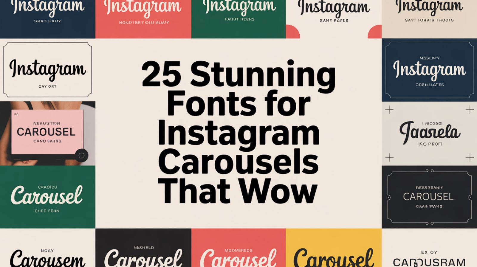
The 25+ Best Fonts for Instagram Carousel Posts (2025 Edition)
Here are my picks. I’ve used many of these in client work (and yes, I’ve flopped some too). Note: free and premium mix, described simply. Grab the ones you need.
1. Montserrat Bold Clean & Modern Look
MS designer Julieta Ulanovsky created this geometric sans that feels modern but human. Great for headings.
Why I like it: Works well across devices; pairs easily.
Usage tip: Use Montserrat Bold for headings; body can be Montserrat Regular.
2. Open Sans Italic Friendly and Readable
A widespread sans serif from Google Fonts; classic, safe, readable.
Why I like it: Ideal for body text, so your main message is clear.
Usage tip: Use Italic for a subtle stylistic twist.
3. Raleway Bold Elegant Minimalist Typeface
Designed by Matt McInerney in 2009. The thin line version is elegant; the Bold version gives weight for headings.
Usage tip: Good for clean, minimalist carousels.
4. Lato Regular Balanced Professional Vibe
A friendly sans serif that mixes professional and approachable.
Usage tip: Use for sub-text under a Bold heading.
5. Roboto Slab Bold Strong, Geometric Typeface
Designed by Christian Robertson. Big, bold, slab-style: perfect when you want serious impact.
Usage tip: Use this for attention-grabbing slides with minimal other text.
6. Playfair Display Perfect for Quotes and Brands
Classic serif; chic; good for motivational or lifestyle posts.
Usage tip: Use Playfair Display for headings on a full-image background.
7. Nunito Sans Smooth, Rounded Typeface for Clarity
Friendly rounded sans; good when you want less harsh corners.
Usage tip: Pair with a heavier font like Montserrat.
8. Anton Bold and Attention-Grabbing Headings
Display sans with very heavy weight; screams “look here”.
Usage tip: Use for slide titles in carousels; avoid for body text.
9. Abel Modern Simplicity with Clean Lines
Less used than some others; good for designers who want something subtle but fresh.
Usage tip: Use for minimalist feed designs.
10. Zeyada Handwritten, Creative Font for Lifestyle Pages
Organic handwritten style, ideal for influencers or playful brands.
Usage tip: Use sparingly—too much handwriting can harm readability.
11. Crimson Bold Elegant Serif for Classy Posts
Designed by Giovanni Mardersteig; historical serif; great for brand-rich carousels.
Usage tip: Use for premium brand posts.
12. Boho Lifestyle Cute, Girly Font for Feminine Brands
Script + decorative style; ideal for lifestyle influencers.
Usage tip: Use for title slide; pair with a simple sans for body.
13. Clover Grotesk Modern Font for Fashion Carousels
Nine weights; flexible for headers/subheaders; great for fashion- or brand-centric posts.
14. Berlin Bold, Sharp and Trendy Streetwear Look
Based on work by Adrian Frutiger for Linotype; older design, but very usable in 2025 for bold brand visuals.
15. Blogger Sans Fun, Youthful Typography
Handwriting-inspired sans; perfect for casual lifestyle carousels.
16. Malibu Relaxed Handwritten Font for Quotes
Brush style: great for beach/lifestyle vibe.
17. Juvenile Playful Instagram Font for Teens
Mid-century handwriting style; useful for younger audience content.
18. GASTON Luxury, Bold Serif for Premium Brands
Serif with a luxury feel; good when your brand wants refinement.
19. Indigo Chunky Font for Contrast Headlines
Bold, blocky type; excellent for attention-grabbing.
20. CalliGraffiti Urban Handwritten Font
Street art / urban vibe; fits certain brand types.
21. Techbit Pixel Font for Tech Creators
Five styles; perfect for tech or retro-gaming themed carousels.
22. Franie Geometric Sans-Serif for Sleek Layouts
18 styles; lots of flexibility for custom typography.
23. Bellindo Brush Font for Artistic Feeds
Elegant brush strokes; explore this for creative brands.
24. Bitbybit Pixel-Inspired Font for Retro Feeds
Retro gaming vibe; good for fun or nostalgic posts.
25. Extra Blue Cute Script for Influencers
Bubbly script; ideal when you want a playful, happy tone.
Related Post: 150+ Aesthetic Captions for Instagram That Elevate Your Vibe
Bonus Picks (Free/Limitless Use)
- Techno Bold and modern, free for personal use.
- Inktype Typewriter-style free font.
- Qandas Handwriting Style free font.
- Donut Birtnis Fun, food-brand-friendly free font.
Free Fonts for Instagram Carousels

If you’re on a budget (IMO everyone starts here), check out solid free options:
- Roboto (Google Fonts)
- Open Sans (Google Fonts)
- Lora (Google Fonts)
- Poppins (Google Fonts)
- DM Sans (Google Fonts)
Licensing tip: many are free for personal use, but check commercial use if you run an ad or product. “Free fonts for Instagram” doesn’t always mean “free for business”.
Premium Fonts Worth Investing In
Some brands deserve better. If you want “unique” rather than “okay”, consider premium fonts:
- Kalista – luxury font duo with 40+ ligatures.
- Sand Grain – adventure / summer vibe font.
- Zoro – hand-drawn script with multiple styles.
- Baou – bold modern sans with personality.
Why buy? Because “fonts that increase post visibility” also include unique ones viewers haven’t seen a thousand times. Us trusted sources: Creative Market, Envato Elements.
CTA: If you brand often, spend the few bucks once and stop worrying.
Best Font Pairings for Instagram Carousel Posts
Pairing fonts = smart design. Here are combos that work:
- Montserrat Bold + Open Sans Regular
- Playfair Display + Lato
- Anton + Poppins
Why? Contrast! A heavy heading font + readable body = clear hierarchy. That ties directly into typography hierarchy and readability and contrast.
Font Styles by Niche
Certain font styles work better depending on your niche.
- Fashion & Lifestyle: Playfair Display, Boho Lifestyle, Malibu
- Tech & Business: Montserrat, Roboto, Techbit
- Education & Motivation: Lato, Open Sans, Nunito Sans
- Luxury Brands: GASTON, Kalista, Clover Grotesk
- Personal Brands & Influencers: Zeyada, Bellindo, Extra Blue
As you pick your font, ask: does this fit my audience and my brand tone?
Mistakes to Avoid When Choosing Carousel Fonts
Here are traps I’ve seen too many times (and yes, I once used 5 fonts in one slide oops).
- Using too many typefaces in one carousel. Stick to max 2-3.
- Ignoring letter spacing, alignment, or text overlay design.
- Low contrast between text and background kills readability.
- Overusing decorative or cursive fonts for body text (hard to read on mobile).
If you trap one of these, your post still looks messy even if the message is good.
How to Add Custom Fonts to Your Instagram Carousel Designs
Here’s how I add custom fonts when designing with Canva, Figma or Adobe Express:
- Upload your font file (OTF/TTF) or choose from Google Fonts linked library (via Adobe Fonts or Font Squirrel).
- Use a heading font for slide title (e.g., Montserrat Bold), body font for supporting text (e.g., Open Sans).
- Set proper typography hierarchy: heading size > body size.
- Apply text overlay design: ensure readability by adding semi-transparent overlay behind text, adjusting letter spacing and alignment.
- Export and upload to Instagram Carousel format (1080 × 1350 px is a safe size).
Try this next time—it takes maybe 5 minutes and saves big headaches later.
Pro Tips to Boost Engagement with Font Design
Since we’re playing for serious results:
- Trend alert: In 2025, you’ll see bold minimalism, geometric font design, and a serif comeback.
- Keep visual consistency across all your carousels. This builds brand recognition (brand consistency through fonts).
- Limit yourself to a max of 3 font sizes per carousel. Too many sizes = chaos.
- Use fonts for emotional storytelling posts. Want to evoke a feeling? Try a script font + warm color. Want action? Heavy sans + watchful spacing.
- Always preview on mobile. What looks good on desktop might flop on a phone.
FAQs about Fonts for Instagram Carousels
Q: What is the most popular font for Instagram carousels?
There’s no single magic font, but sans serif typefaces such as Montserrat or Open Sans are very common thanks to readability and modern look.
Q: Are Canva fonts free for commercial use?
Many are, but some premium fonts on Canva require a Pro license. Always check the licensing details per font.
Q: How many fonts should I use per carousel?
Generally, stick with two to three. One for headings, one for body text, maybe one accent. More than that = visual confusion.
Q: Which fonts are best for quotes vs educational posts?
For quotes: a display or script font (like Malibu or Boho Lifestyle) works. For educational posts: clean sans like Nunito Sans or Open Sans helps readability.
Q: Can I use Google Fonts for Instagram graphics?
Yes. Google Fonts (via Google Fonts library) offers many free options for personal/commercial use. Just check each font’s license before use.
Conclusion
So, there you have it the best fonts for Instagram carousel posts that’ll instantly level up your feed in 2025. Whether you go for bold typefaces like Anton or elegant scripts like Playfair Display, remember one golden rule: consistency beats complexity. Fonts aren’t just design tools; they’re part of your brand’s voice. Test a few combinations, experiment with contrast, and find the perfect fit for your audience. IMO, fonts like Montserrat or Lato are timeless choices that never go out of style. And FYI, always check licensing if you’re using premium ones from Creative Market or Adobe Fonts. Now go ahead tweak, test, and post like a pro. Because, honestly, your carousel deserves better typography. 🙂
Welcome to Depthoverdrive,
I’m William, a passionate SEO content writer with 3 years of experience in crafting engaging, optimized, and reader-friendly content. I specialize in creating content that not only ranks on search engines but also provides real value to readers, with a strong understanding of keyword research, on-page SEO, and content strategy.

